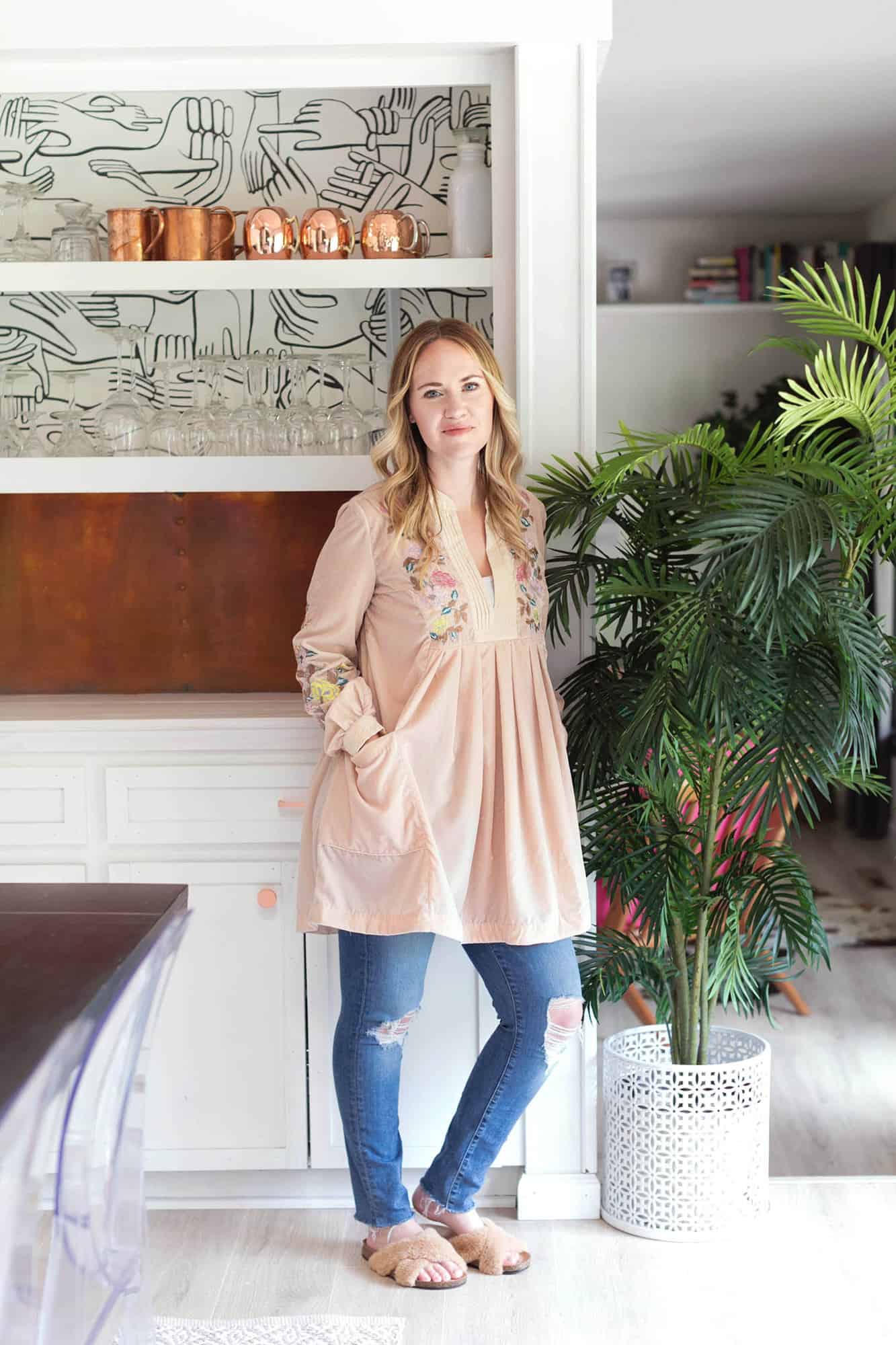
Somewhat unintentionally, our house has become more and more monochromatic over time. I personally love color, and always will. Ha. But when it comes to decor, at least for now, I crave simplicity. I want our home to feel calm and inviting.
I’ve also been going through a pretty major clean out phase as I’ve become more and more obsessed with the KonMari method. But, who hasn’t? Other than our garage (which still needs some work), I feel like I know where every single thing in our home is, what it’s for, and it all sparks joy.
Of course, this paring down of items is an ongoing one (or at least it is in our house). But I’ve found that I love it and it makes me feel so much more relaxed. And, it seems to creep into the decor of our home as well, as it forces me to edit things down to only what I love and feels right in a space.
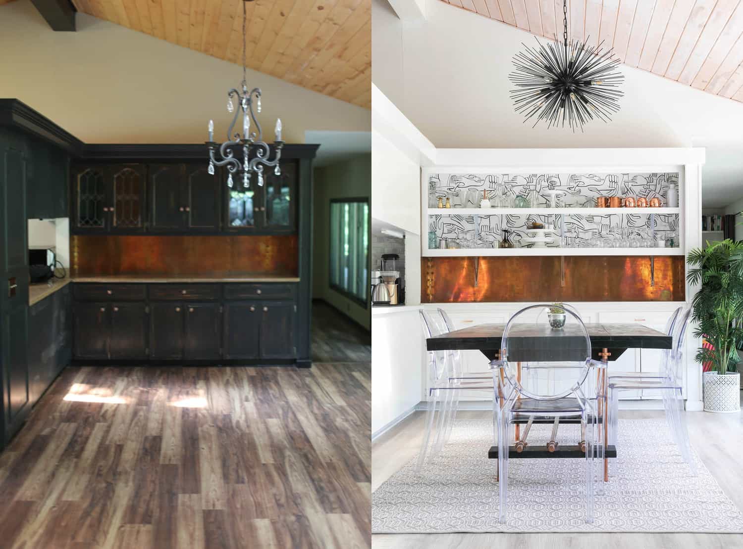
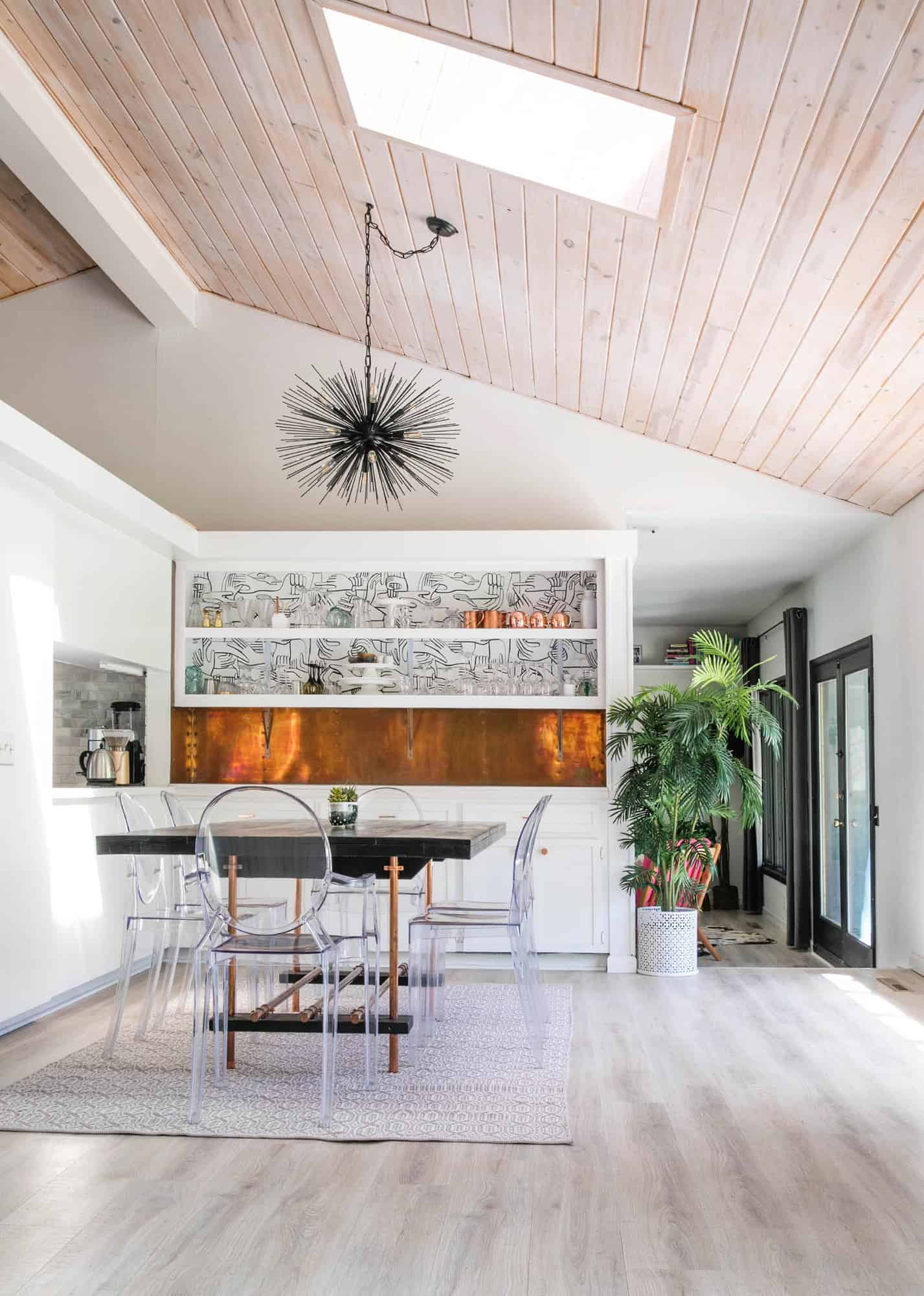
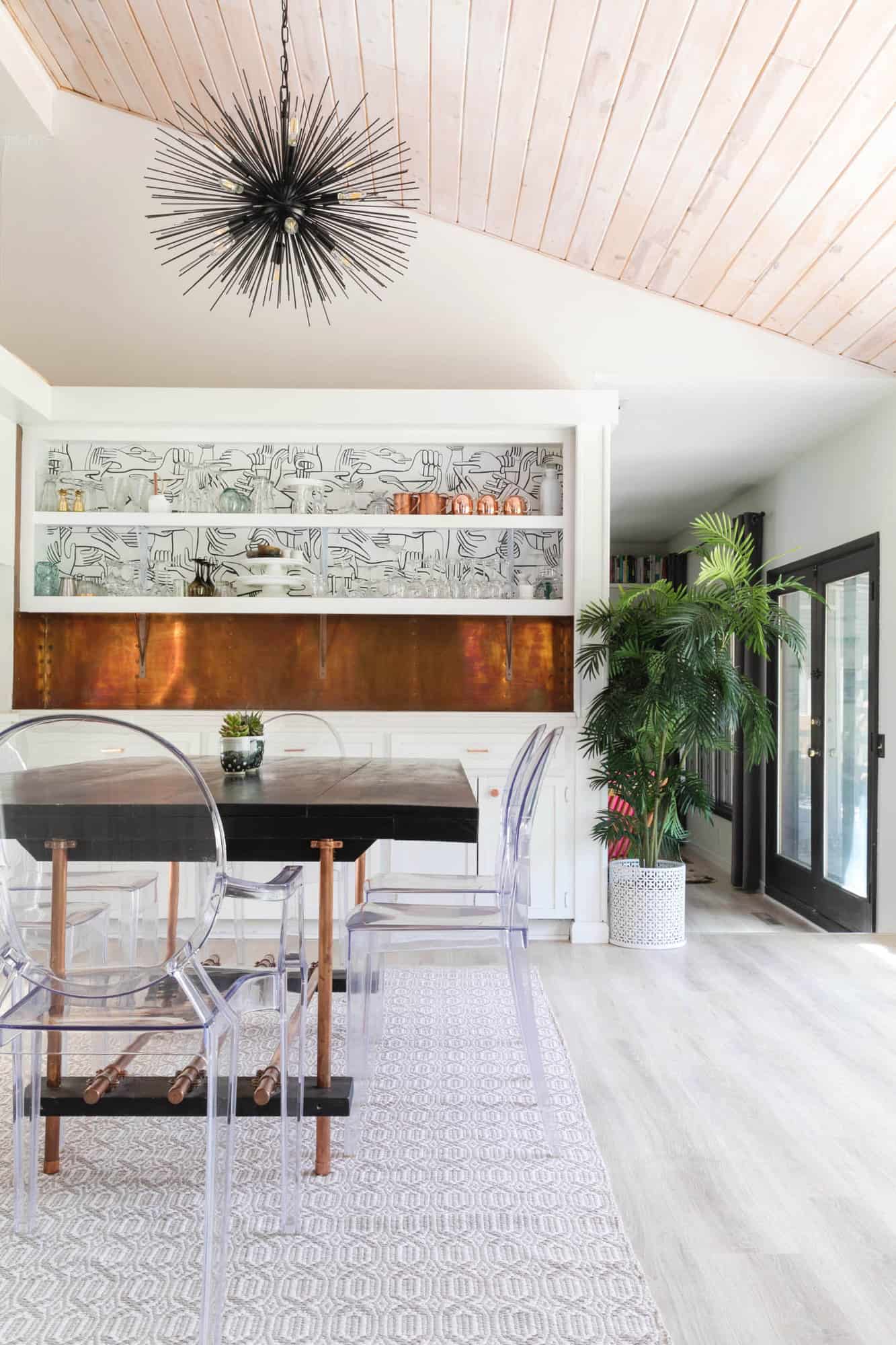
Anyway, if you were to play “what’s different in these photos,” you’d probably note right away:
-The floors are different.
-The ceiling is a different shade (I stained it white).
-The built-in cabinet has been painted and updated.
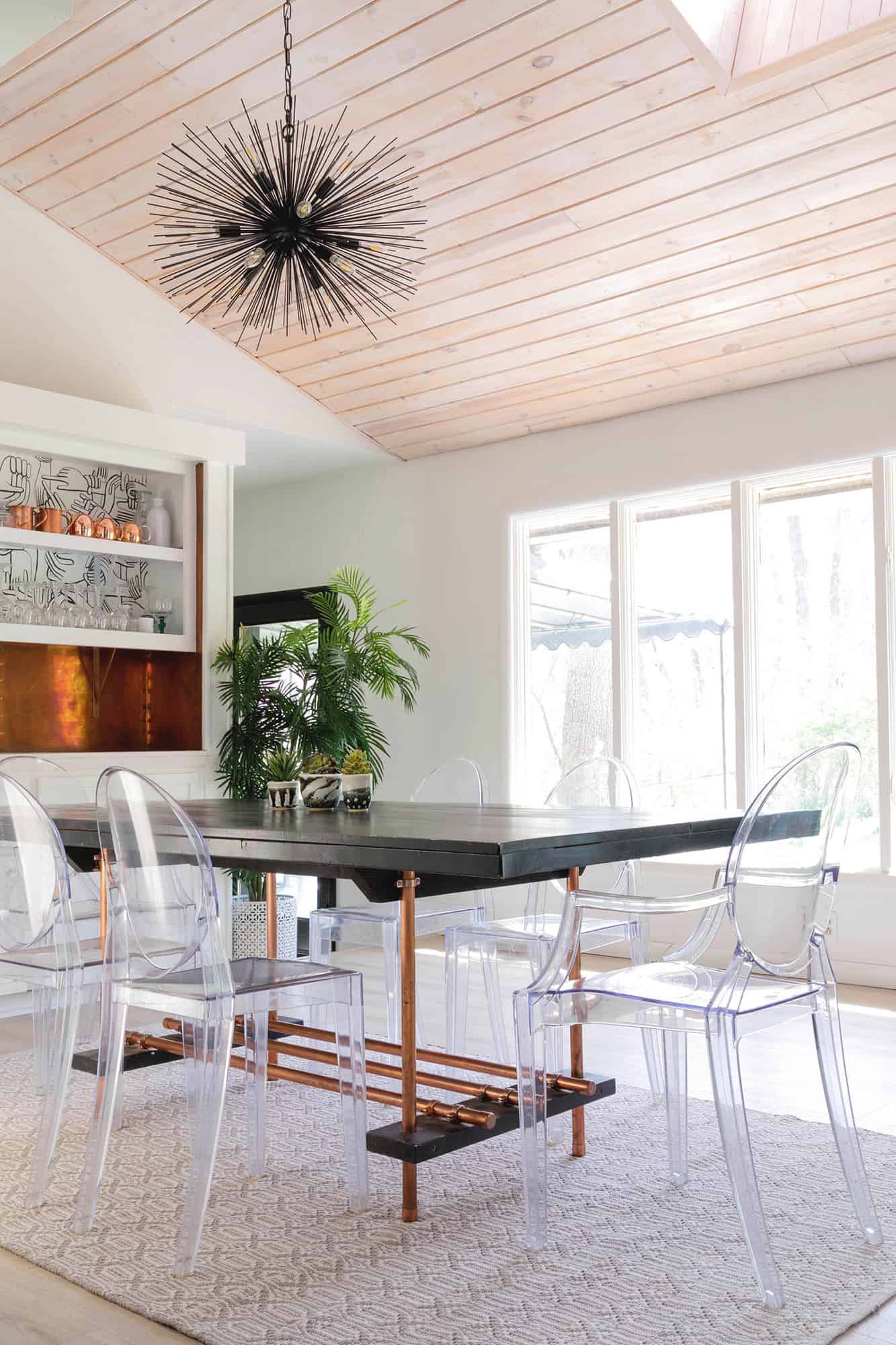
-The chandelier is different.
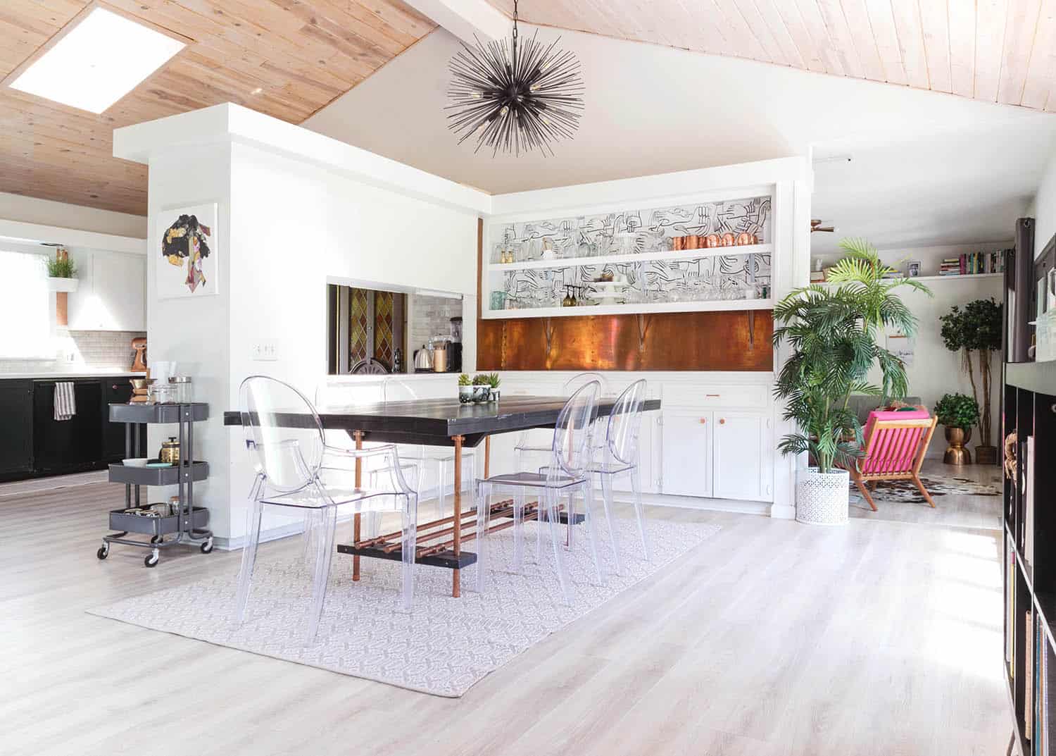
I also wanted a light that came on a chain because it’s always bothered me how the spot where the light connects to the ceiling is not centered with the built-in cabinet. This just always felt a little visually wrong to me. Of course, it’s not such a major deal that I would want to replace the boards in the ceiling to move it, but with a chain I figured I could just have a sturdy hook and simply hang the light over a little so it was centered. We choose this chandelier and I LOVE it.
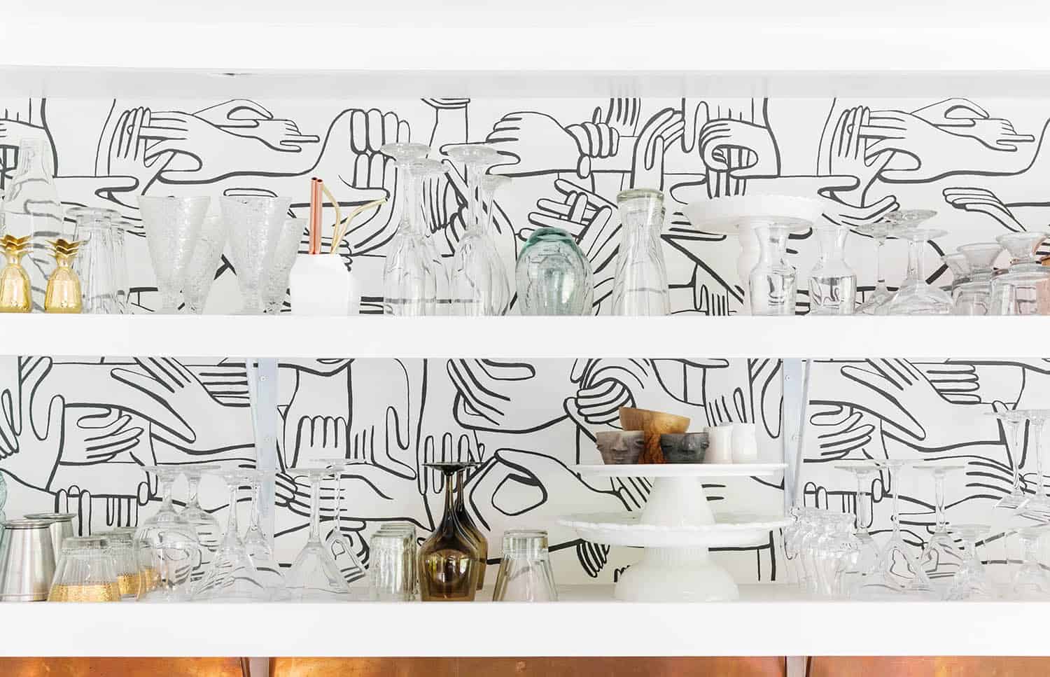
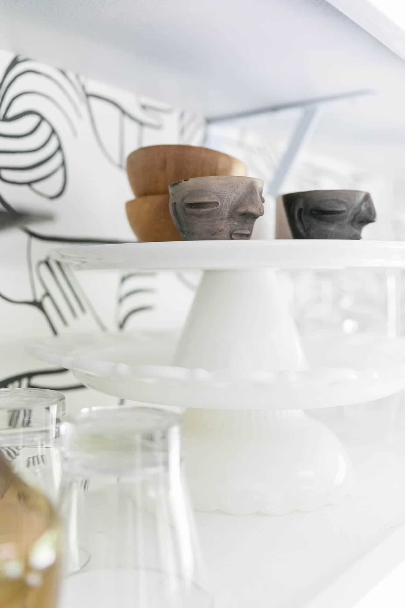
I still have the same dining table and chairs I’ve had since moving in. Our glassware collection is sort of always evolving a little, like I recently got those cute little face cups. They are handmade from Oaxaca, Mexico when I went with Thread Caravan on a girls trip earlier this year. I’m not a massive souvenir person, but I love sipping rum from these cups (they are meant for Mezcal).
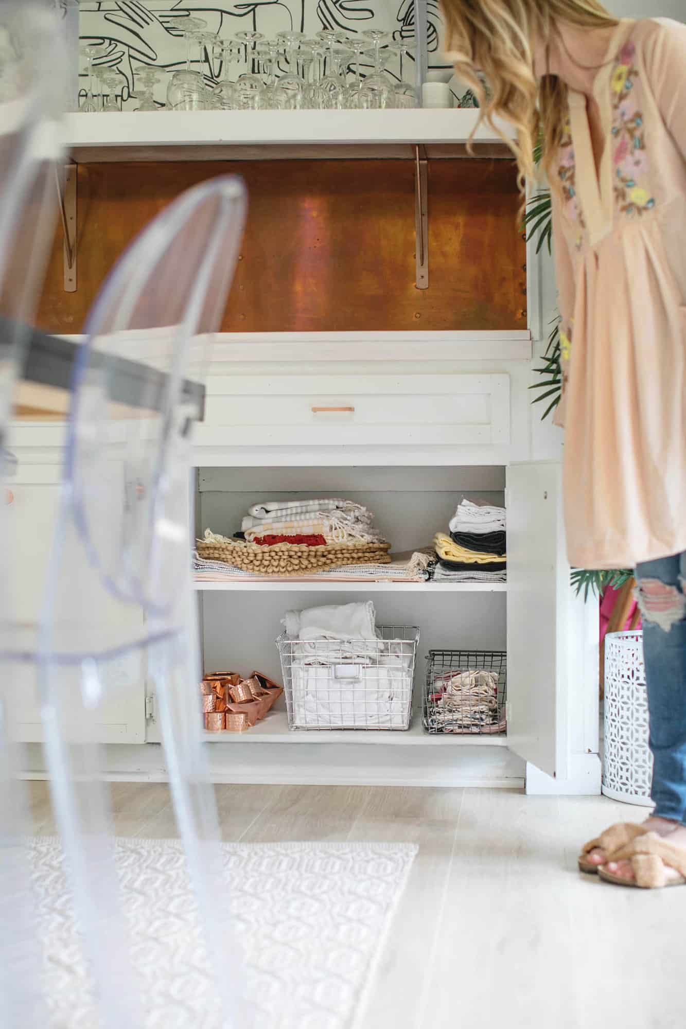
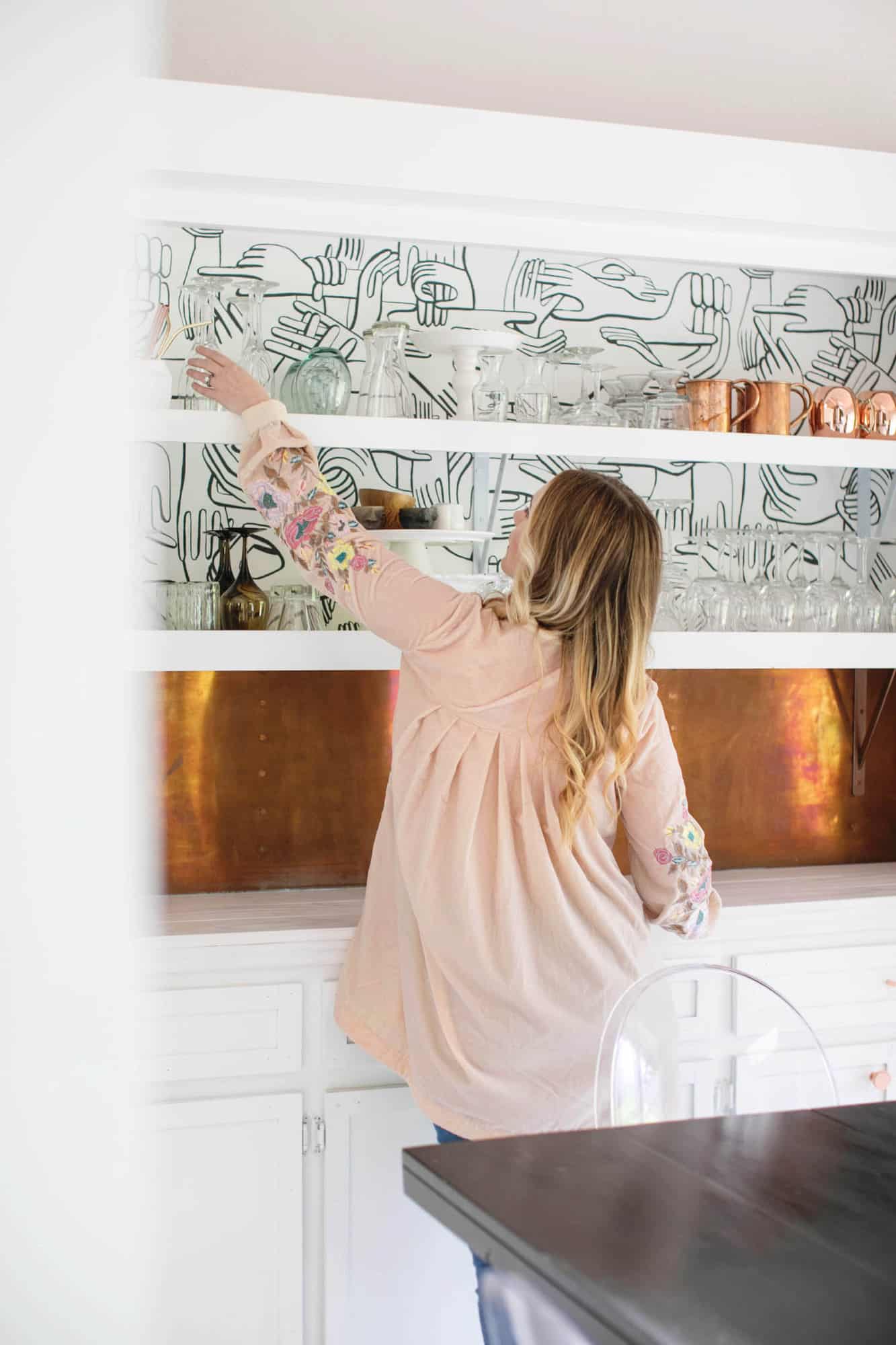
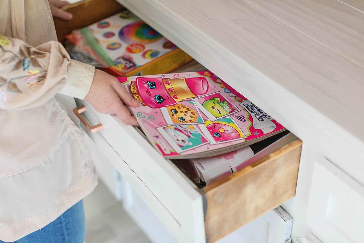
I also do all my recipe testing and photography for our blog at my house, so I have space for all my different linens and other props. Trey and I also tend to host at least a couple larger dinner parties each year, so I have a LOT of extra plates and things for those parties that I store in this cabinet.
I can’t decide if I’ll host Friendsgiving in my home this year or if we’ll host it at the SGF Bnb house … I guess that’s still a ways away. But I love thinking about it, as it’s one of my favorite “blog features” we do each year. 🙂
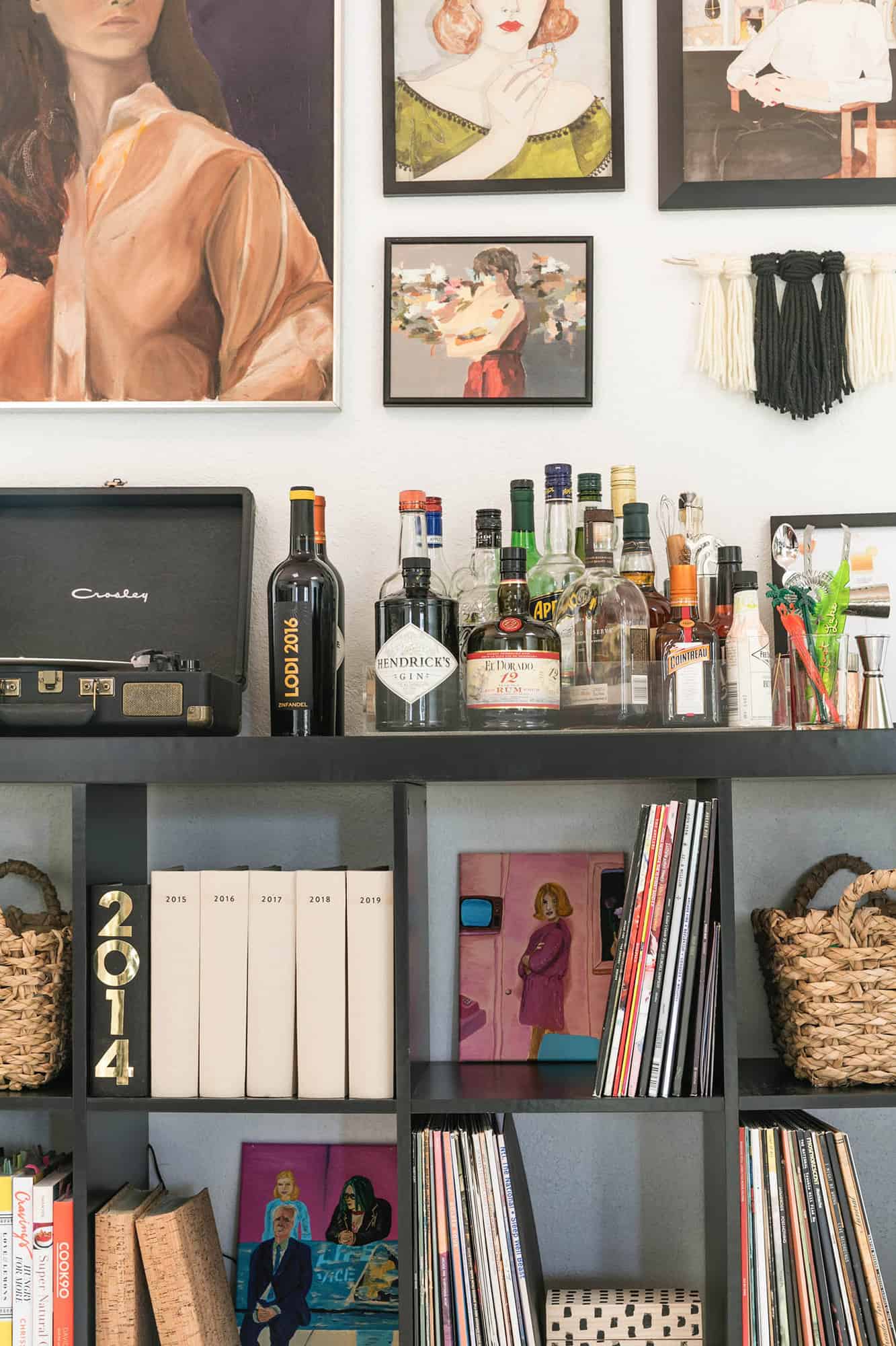
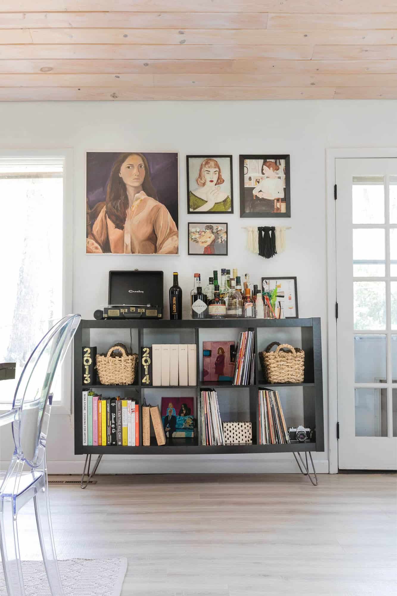
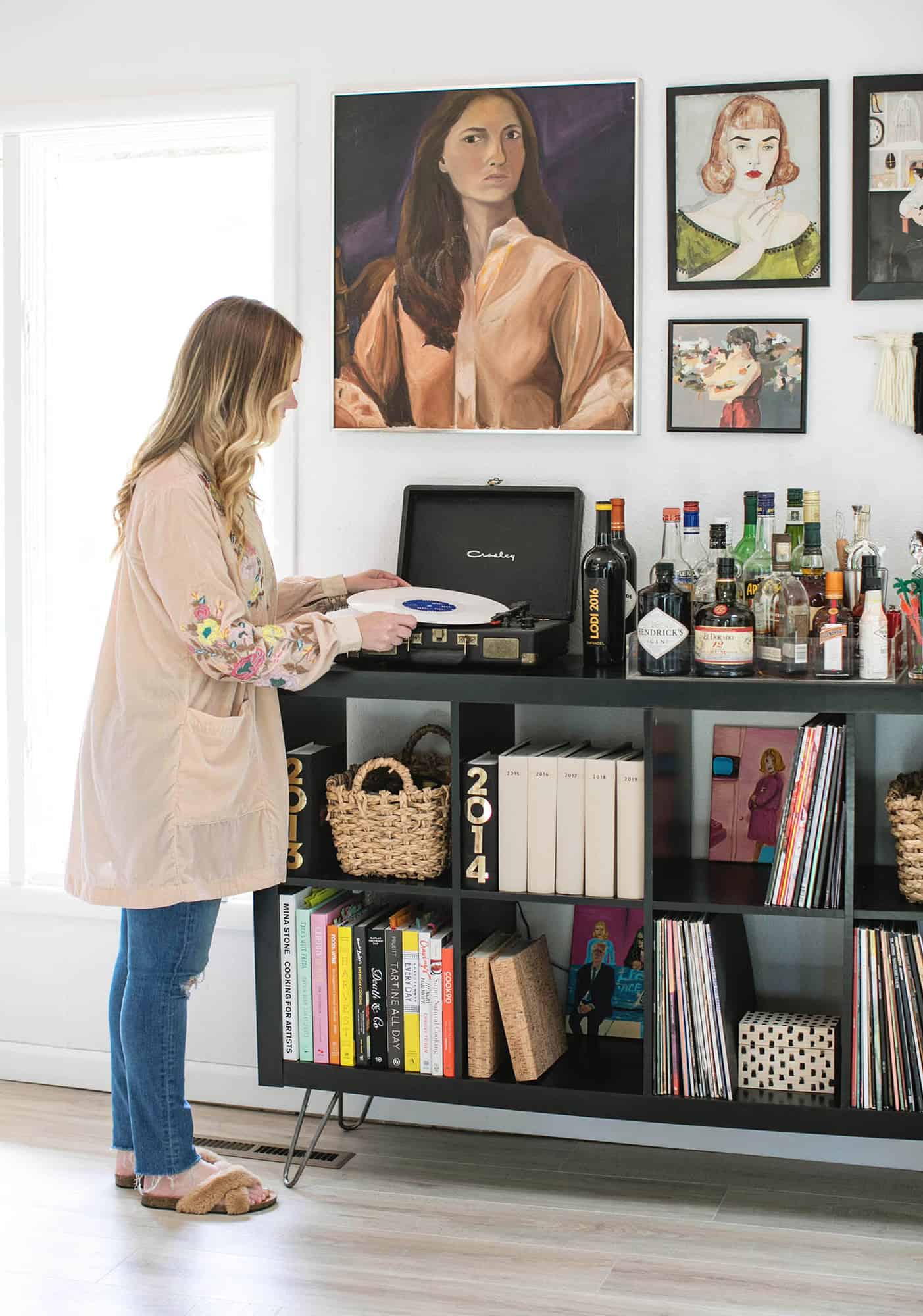
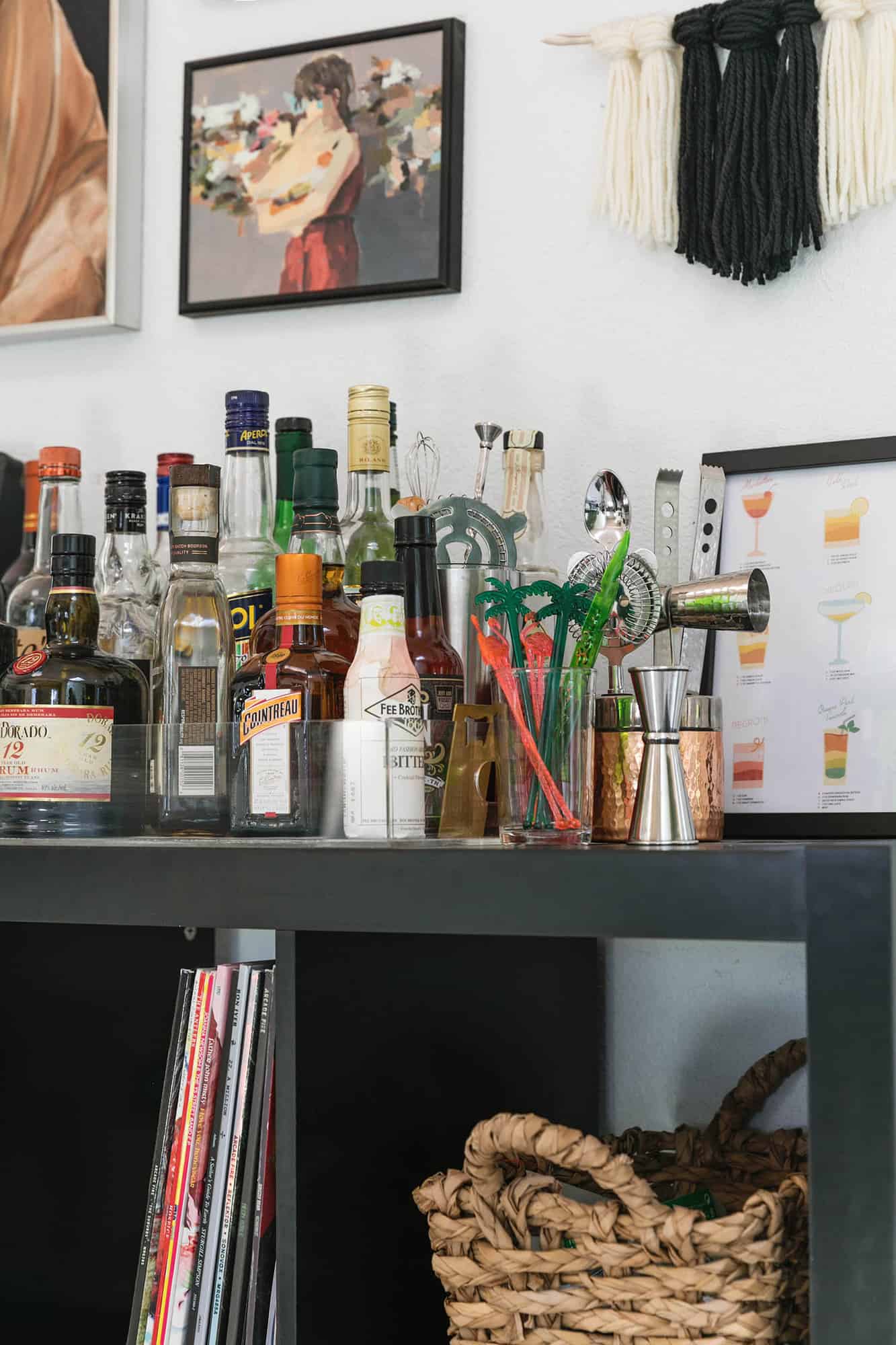
This is also the space that holds our liquor cabinet and bar tools, record player and record collection, many of the cookbooks I use most often (this rotates all the time), and just a few other small items we frequently use. This is also where I store our annual photo albums.
Thanks for letting me share my current dining room with you! Now let’s see if I do this again in a couple years because clearly I cannot leave well enough alone. xo. Emma
Room Details: Chandelier/ Rug: Similar/ Dining Table: DIY / Chairs / Wallpaper / Liquor Cabinet + I added hairpin legs / Gallery art from: our mom, Clare Elsaesser, Vivian Strauss, and paintings in cabinet / Designing Indie. And just in case you are curious, my shirt is from Free People and my shoes are from Target.
Ah so neat to see where those two little paintings ended up! Just where I would be–with the records, photos, art, and drinks! xo Thanks for the shout out.
I was wondering about your shirt! Love the before and after, too, and love konmari!
It”s looks amazing!
just commented on the wallpaper – I see it linked now, thanks!
source for the fab wallpaper with the intertwining hands?
It looked amazing before and it looks stunning now! You have a great eye for interior design! I really love how you lightened the room up. Love it!
Wow! Great job Emma. Love the colours, especially how you used the occasional pops of pink.
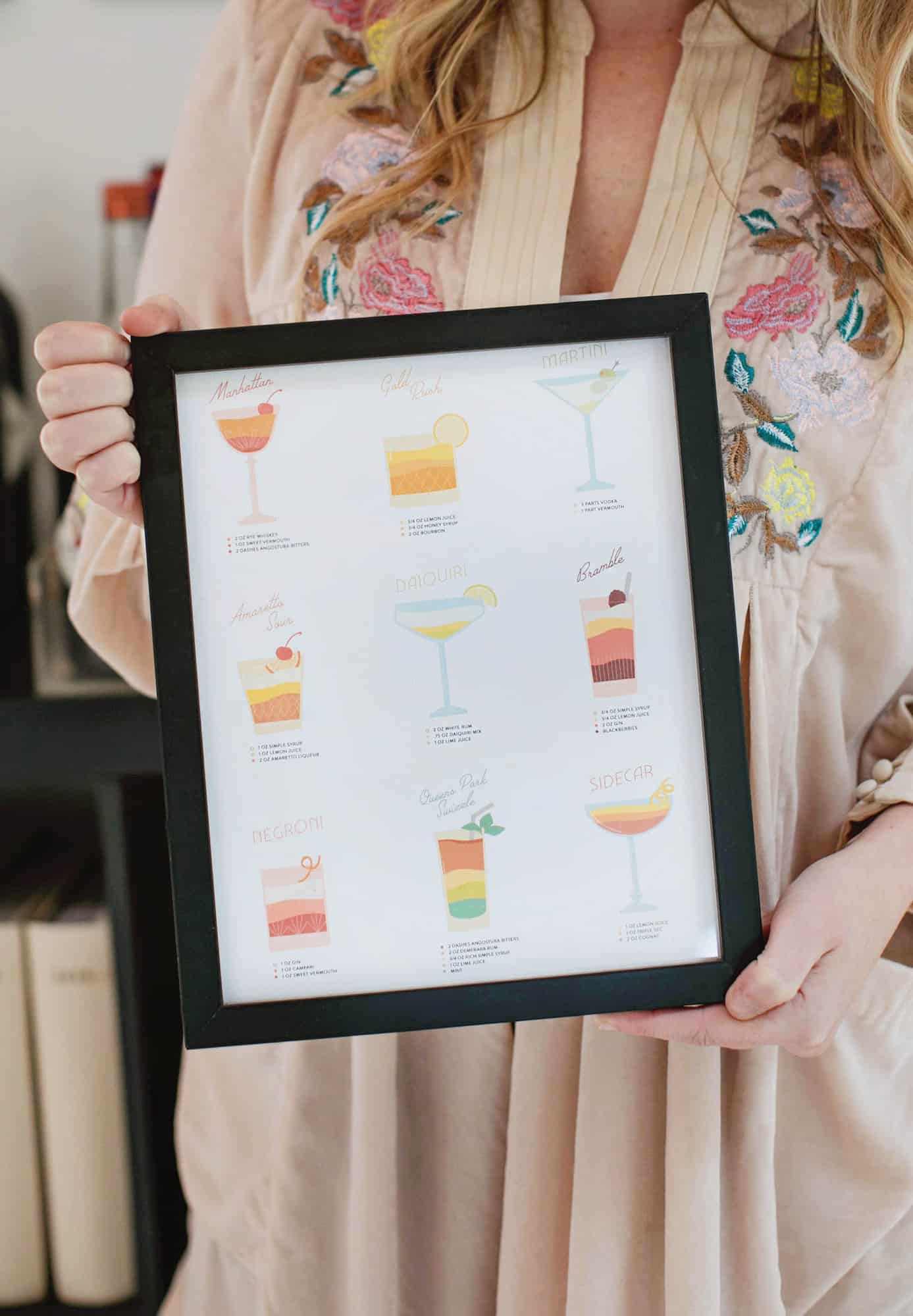
I’m loving the cocktail print. Thanks so much. Just one thing…I live in Ireland and we dont use ounces. We use millilitres to measure. Martini is my fave so the 3 parts vodka 1 part vermouth works for me!! Love the blog btw!!
The copper (I think) panels are lovely. Any ideas of sources? How are they attached to the wall? Thank you.
Obsessed with all the art you’ve collected! ????
Thanks. Can’t wait to see what YOU do in YOUR new house Ana. (!!!!!!!!!)
Hi Emma- I love your shirt in these pics! Where is it from?
Free People, but I bought it at a discount store so it may not be available anymore (this one had a tiny rip in the armpit I was able to easily stitch back up)
If we sign up for the email list now can we still get a copy of that print??
Yes. It will be sent to you automatically when you sign up. 🙂
Love all the changes you made! That white staining on the ceiling is definitely my favorite part! Thanks for sharing, hope you’re having a lovely day.
-Kate
https://daysofkate.com/
Love the bold black colour on the white palette! So pretty! 🙂
Charmaine Ng | Architecture & Lifestyle Blog
http://charmainenyw.com
Thanks! I love black and white. Maybe it can be a bit boring at times, but it just makes things so simple and I really like that. 😉
Absolutely Love iT. I can’t believe the transformation. The see through chairs are very cool. Good job.
Thanks! We’ve had those ghost chairs for so long now. I love that they can go with a number of different styles / color schemes. I’ve certainly used them with different tables / spaces over the years.
Ahh, ‘Ghost Chairs’ – I was struggling for a word for those chairs. I could see using them in different settings. Love your taste and eye.
What a great job on the renovation. It looks incredible… and SO ORGANIZED! What an awesome living space!
Thank you! I have been really minimizing our home and that makes it much easier to stay organized. But of course, this is what our home looks like when it’s clean. 🙂 It’s not clean every single day, but overall it’s much easier to keep tidy.